# Introduction


<!-- WARNING: THIS FILE WAS AUTOGENERATED! DO NOT EDIT! -->

## VISET on real gene sets

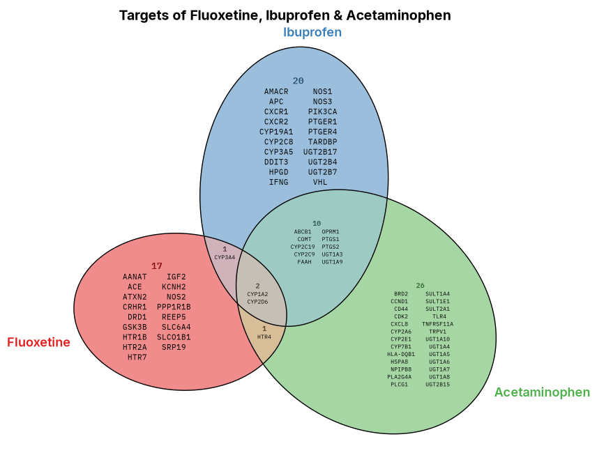
Here are three drug-target gene sets in VISET (the same ones drawn
plainly under [State of current set
diagrams](state_of_set_diagrams.html)): proportional ellipses from
eunoia, every gene printed inside its region, and each list auto-sized
to fit.

<details class="code-fold">
<summary>Code</summary>

``` python
import os
import matplotlib.pyplot as plt
from matplotlib import font_manager
from viset import load, eunoia_venn

fp = "Font" if os.path.isdir("Font") else "../Font"
for f in font_manager.findSystemFonts(fontpaths=[fp]):
    font_manager.fontManager.addfont(f)

db = "Drug target sample files/" if os.path.isdir("Drug target sample files") else "../Drug target sample files/"
flu = load(db + "1. FLUOXETINE_sample.csv", "Gene names", "Fluoxetine")
ibu = load(db + "2. IBUPROFEN_sample.csv", "Gene names", "Ibuprofen")
acet = load(db + "3. ACETAMINOPHEN_sample.csv", "Gene names", "Acetaminophen")
eunoia_venn([flu, ibu, acet], colors="Set1", figsize=(9, 8),
            title="Targets of Fluoxetine, Ibuprofen & Acetaminophen")
```

</details>

<figure>
<img src="02_introduction_files/figure-commonmark/cell-2-output-1.png"
alt="The same three drug-target gene sets in VISET: proportional ellipses, with every gene printed inside its region." />
<figcaption aria-hidden="true">The same three drug-target gene sets in
VISET: proportional ellipses, with every gene printed inside its
region.</figcaption>
</figure>

## Install

VISET is not on PyPI. Install the latest from GitHub:

``` bash
pip install git+https://github.com/mnicolee/VISET.git
```

## Quick start

Give each set a CSV with a column of member names, load them, and draw:

``` python
from viset import load, eunoia_venn

ibu = load("IBUPROFEN.csv", "Gene names", "Ibuprofen")
ace = load("ACETAMINOPHEN.csv", "Gene names", "Acetaminophen")

eunoia_venn([ibu, ace], colors=["#3a7ca5", "#e08a3c"], style="round")
```

[`eunoia_venn`](https://mnicolee.github.io/VISET/venn.html#eunoia_venn)
draws proportional, itemized Venn/Euler diagrams and
[`upset`](https://mnicolee.github.io/VISET/upset.html#upset) does the
same as an UpSet plot. Each also has a Plotly version
([`eunoia_venn_interactive`](https://mnicolee.github.io/VISET/venn_interactive.html#eunoia_venn_interactive),
[`upset_interactive`](https://mnicolee.github.io/VISET/upset_interactive.html#upset_interactive))
that reveals crowded regions on hover. Full setup is in [Requirements &
Acknowledgements](core.html).

## The gap VISET fills

There are good tools for set visualization, but they split the job up:
some draw proportional shapes, some label members, some scale to many
sets, and none size the labels to fit. VISET is the one place you get
itemized, auto-sized labels for **both** Venn/Euler and UpSet.

<table>
<colgroup>
<col style="width: 20%" />
</colgroup>
<thead>
<tr>
<th>Tool</th>
<th>Area-proportional?</th>
<th>Members shown?</th>
<th>Labels auto-sized to fit?</th>
<th>UpSet?</th>
</tr>
</thead>
<tbody>
<tr>
<td><a
href="https://pypi.org/project/matplotlib-venn/"><code>matplotlib-venn</code></a></td>
<td>2 sets exact, 3 sets approximate</td>
<td>no, counts only</td>
<td>n/a</td>
<td>no</td>
</tr>
<tr>
<td><a
href="https://pypi.org/project/matplotlib-set-diagrams/"><code>matplotlib-set-diagrams</code></a></td>
<td>yes (circles, 3 sets approximate)</td>
<td>yes, as word clouds</td>
<td>no</td>
<td>no</td>
</tr>
<tr>
<td><a
href="https://upsetplot.readthedocs.io"><code>upsetplot</code></a></td>
<td>n/a</td>
<td>no, counts only</td>
<td>n/a</td>
<td>yes</td>
</tr>
<tr>
<td><a
href="https://github.com/jolars/eunoia"><code>eunoia</code></a></td>
<td>yes (ellipses, exact for 3 sets)</td>
<td>no</td>
<td>n/a</td>
<td>no</td>
</tr>
<tr>
<td><strong>VISET</strong></td>
<td>yes (via eunoia ellipses)</td>
<td>yes, aligned columns</td>
<td><strong>yes</strong></td>
<td>yes, itemized + hover</td>
</tr>
</tbody>
</table>

Put those together and VISET fills the gap: proportional shapes from
eunoia, members printed inside every region, each label grown or shrunk
to fit, and the same treatment for UpSet, plus an interactive hover
version of each for when a region is too crowded to print.

## What VISET adds

Three things, and the last two are where it focuses:

1.  **Itemization.** The actual members are written inside each region
    or bar, not just the counts (the figure above).
2.  **Automatic font-sizing.** Every region is measured and the largest
    readable font is chosen, splitting a list into columns when that
    keeps it legible.
3.  **Interactive hover.** When a region is too crowded for any legible
    font, an interactive version reveals its members on hover.

The same three ideas apply to both **Venn/Euler** diagrams (2 to 3 sets)
and **UpSet** plots (any number of sets), each with a static
(Matplotlib) and an interactive (Plotly) version.

### Automatic font-sizing

Itemization only helps if the members are readable, and regions vary
enormously in size: a large single set has room to spare, while a
three-way overlap can be a sliver. So VISET sizes the text per region
instead of using one fixed font, and the two plot types need different
geometry.

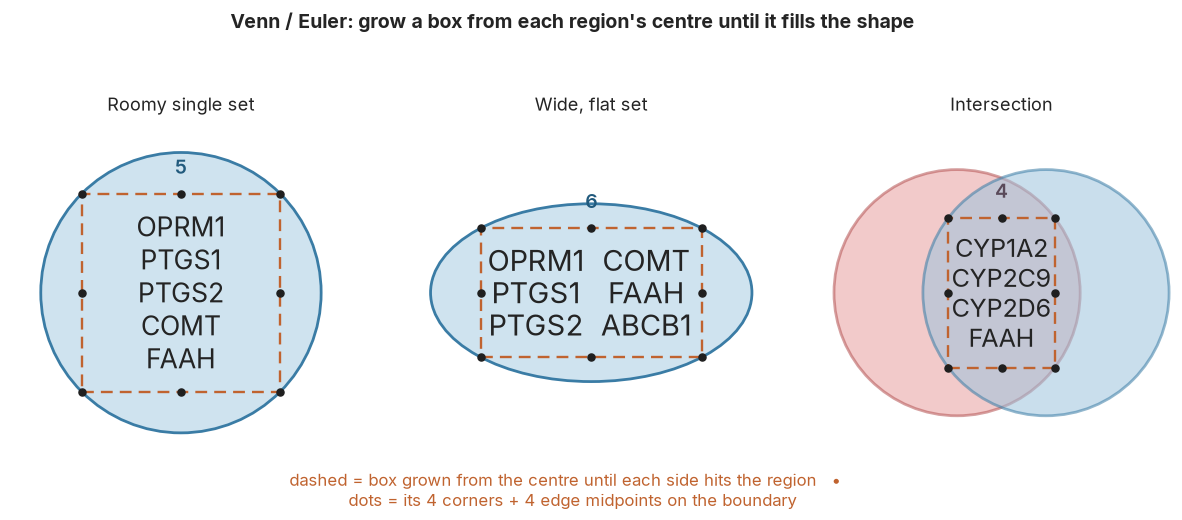
**Venn / Euler regions: fit a box inside a curved area.** A region is a
curved 2-D shape (a disc, a crescent, a lens). VISET anchors a box at
the region’s deepest point and grows it outward until each side hits the
boundary, then grows the member font as large as will fill that box.
Because the whole box sits inside the region, the shape’s outline can
never cross the text. If a single tall column would force the font below
a legible floor, VISET adds columns: the block gets shorter and wider
and a larger font fits. The same rule runs in the overlaps, where the
box simply sits between the arcs.

<details class="code-fold">
<summary>Code</summary>

``` python
import os
import numpy as np
import matplotlib.pyplot as plt
from matplotlib import font_manager
from matplotlib.patches import Rectangle, Ellipse, Circle

fp = "Font" if os.path.isdir("Font") else "../Font"
for f in font_manager.findSystemFonts(fontpaths=[fp]):
    font_manager.fontManager.addfont(f)
plt.rcParams["font.family"] = "Inter"

INK, BOX, DOT, FILL, EDGE = "#242424", "#c0632f", "#1f1f1f", "#cfe3ef", "#3a7ca5"
gx = np.linspace(0, 10, 300); gy = np.linspace(0, 10, 300); GX, GY = np.meshgrid(gx, gy)

def max_rect(mask):
    "Largest axis-aligned rectangle inside `mask`; returns (x0, y0, x1, y1)."
    h, w = mask.shape
    heights = np.zeros(w, int); best = 0; box = None
    for i in range(h):
        for j in range(w):
            heights[j] = heights[j] + 1 if mask[i, j] else 0
        st = []
        for j in range(w + 1):
            cur = heights[j] if j < w else 0
            while st and heights[st[-1]] > cur:
                t = st.pop(); l = st[-1] + 1 if st else 0; rgt = j - 1
                a = heights[t] * (rgt - l + 1)
                if a > best:
                    best = a; box = (l, rgt, i - heights[t] + 1, i)
            st.append(j)
    l, rgt, ti, bi = box
    return gx[l], gy[ti], gx[rgt], gy[bi]

def draw_box(ax, x0, y0, x1, y1, lines, cols):
    ax.add_patch(Rectangle((x0, y0), x1 - x0, y1 - y0, fill=False, ec=BOX, lw=1.7, ls=(0, (5, 3)), zorder=5))
    xm, ym = (x0 + x1) / 2, (y0 + y1) / 2
    pts = [(x, y) for x in (x0, xm, x1) for y in (y0, ym, y1) if not (x == xm and y == ym)]
    ax.scatter([p[0] for p in pts], [p[1] for p in pts], s=26, color=DOT, zorder=6)
    bw, bh = x1 - x0, y1 - y0
    per = -(-len(lines) // cols)
    fs = max(min(bh * 24 / (per * 1.45), (bw / cols) * 24 / (max(len(s) for s in lines) * 0.63), 21), 8)
    step = bh / (per + 1)
    xs = [x0 + bw * (c + 0.5) / cols for c in range(cols)]
    for c in range(cols):
        for r in range(per):
            k = c * per + r
            if k < len(lines):
                ax.text(xs[c], y1 - (r + 1) * step, lines[k], ha="center", va="center", fontsize=fs, color=INK)
    return x0, y0, x1, y1

def count(ax, x0, x1, y1, s, color):
    ax.text((x0 + x1) / 2, y1 + 0.45, s, ha="center", va="bottom", fontsize=14, fontweight="semibold", color=color)

fig, axes = plt.subplots(1, 3, figsize=(15, 5.4))
for ax in axes:
    ax.set_xlim(0, 10); ax.set_ylim(0, 10); ax.set_aspect("equal"); ax.axis("off")
ax = axes[0]
ax.add_patch(Circle((5, 5), 4.1, facecolor=FILL, edgecolor=EDGE, lw=2))
b = draw_box(ax, *max_rect((GX - 5) ** 2 + (GY - 5) ** 2 <= 4.1 ** 2), ["OPRM1", "PTGS1", "PTGS2", "COMT", "FAAH"], 1)
count(ax, b[0], b[2], b[3], "5", "#215a7d")
ax.set_title("Roomy single set", fontsize=13, color=INK, pad=8)
ax = axes[1]
ax.add_patch(Ellipse((5, 5), 9.4, 5.2, facecolor=FILL, edgecolor=EDGE, lw=2))
b = draw_box(ax, *max_rect(((GX - 5) / 4.7) ** 2 + ((GY - 5) / 2.6) ** 2 <= 1), ["OPRM1", "PTGS1", "PTGS2", "COMT", "FAAH", "ABCB1"], 2)
count(ax, b[0], b[2], b[3], "6", "#215a7d")
ax.set_title("Wide, flat set", fontsize=13, color=INK, pad=8)
ax = axes[2]
ax.add_patch(Circle((3.7, 5), 3.6, facecolor="#e8a0a0", edgecolor="#b45252", lw=2, alpha=0.55))
ax.add_patch(Circle((6.3, 5), 3.6, facecolor="#9dc3de", edgecolor=EDGE, lw=2, alpha=0.55))
m = ((GX - 3.7) ** 2 + (GY - 5) ** 2 <= 3.6 ** 2) & ((GX - 6.3) ** 2 + (GY - 5) ** 2 <= 3.6 ** 2)
b = draw_box(ax, *max_rect(m), ["CYP1A2", "CYP2C9", "CYP2D6", "FAAH"], 1)
count(ax, b[0], b[2], b[3], "4", "#5a4a5a")
ax.set_title("Intersection", fontsize=13, color=INK, pad=8)
fig.suptitle("Venn / Euler: grow a box from each region's centre until it fills the shape",
             fontsize=14, fontweight="bold", color=INK, y=1.02)
fig.text(0.5, 0.1, "dashed = box grown from the centre until each side hits the region   \u2022   \n"
         "dots = its 4 corners + 4 edge midpoints on the boundary", ha="center", fontsize=12, color=BOX)
plt.show()
```

</details>

<figure>
<img src="02_introduction_files/figure-commonmark/cell-3-output-1.png"
alt="Grow a box from each region’s centre until it fills the shape, then fit the biggest font." />
<figcaption aria-hidden="true">Grow a box from each region’s centre
until it fills the shape, then fit the biggest font.</figcaption>
</figure>

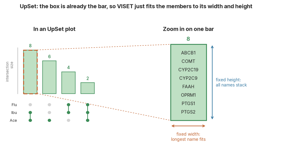
**UpSet bars: the box is already there.** An UpSet bar is a rectangle to
begin with, so there is nothing to search for: VISET takes the largest
font at which the longest name fits the bar’s fixed **width** and all
the members stack within its **height**, adding columns when a bar is
wide enough.

<details class="code-fold">
<summary>Code</summary>

``` python
import os
import matplotlib.pyplot as plt
from matplotlib import font_manager
from matplotlib.patches import Rectangle, Circle, FancyArrowPatch

fp = "Font" if os.path.isdir("Font") else "../Font"
for f in font_manager.findSystemFonts(fontpaths=[fp]):
    font_manager.fontManager.addfont(f)
plt.rcParams["font.family"] = "Inter"

INK, ACC, BOX = "#242424", "#3a7ca5", "#c0632f"
GFILL, GEDGE = "#bfe0c4", "#3c8c57"
fig, ax = plt.subplots(figsize=(11.5, 5.2))
ax.set_xlim(0, 23); ax.set_ylim(0, 11); ax.axis("off")
ax.text(4.3, 10.2, "In an UpSet plot", ha="center", fontsize=13, fontweight="bold", color=INK)
sizes = [8, 6, 4, 2]; bxs = [1.7, 3.3, 4.9, 6.5]; bw0 = 1.15; base = 4.6; maxh = 3.9
ax.plot([1.2, 1.2], [base, base + maxh + 0.2], color="#aaaaaa", lw=1)
ax.text(0.9, base + maxh / 2, "intersection\nsize", ha="right", va="center", fontsize=8.5, color="#777777", rotation=90)
for x, sz in zip(bxs, sizes):
    h = maxh * sz / max(sizes)
    ax.add_patch(Rectangle((x, base), bw0, h, facecolor=GFILL, edgecolor=GEDGE, lw=1.2))
    ax.text(x + bw0 / 2, base + h + 0.15, str(sz), ha="center", va="bottom", fontsize=9.5, color=GEDGE, fontweight="semibold")
ax.add_patch(Rectangle((bxs[0], base), bw0, maxh, fill=False, edgecolor=BOX, lw=2.2, ls=(0, (4, 2)), zorder=6))
rows = ["Flu", "Ibu", "Ace"]; row_y = [3.6, 2.9, 2.2]
member = [[0, 0, 1, 1], [1, 0, 1, 1], [1, 1, 0, 1]]
for r, sy in enumerate(row_y):
    ax.text(1.15, sy, rows[r], ha="right", va="center", fontsize=9, color=INK)
    for c, x in enumerate(bxs):
        ax.add_patch(Circle((x + bw0 / 2, sy), 0.14, facecolor=GEDGE if member[r][c] else "#d4d4d4", edgecolor="none", zorder=3))
for c, x in enumerate(bxs):
    ys = [row_y[r] for r in range(3) if member[r][c]]
    if len(ys) > 1:
        ax.plot([x + bw0 / 2] * 2, [min(ys), max(ys)], color=GEDGE, lw=1.6, zorder=2)
ex0, ey0, ew, eh = 14.0, 2.2, 3.0, 6.8
hx1 = bxs[0] + bw0
ax.plot([hx1, ex0], [base + maxh, ey0 + eh], color=BOX, lw=1, ls=(0, (3, 3)), zorder=1)
ax.plot([hx1, ex0], [base, ey0], color=BOX, lw=1, ls=(0, (3, 3)), zorder=1)
ax.text(ex0 + ew / 2, 10.2, "Zoom in on one bar", ha="center", fontsize=13, fontweight="bold", color=INK)
ax.add_patch(Rectangle((ex0, ey0), ew, eh, facecolor=GFILL, edgecolor=GEDGE, lw=2))
genes = ["ABCB1", "COMT", "CYP2C19", "CYP2C9", "FAAH", "OPRM1", "PTGS1", "PTGS2"]
ax.text(ex0 + ew / 2, ey0 + eh + 0.2, "8", ha="center", va="bottom", fontsize=13, fontweight="semibold", color=GEDGE)
step = eh / (len(genes) + 1)
for i, g in enumerate(genes):
    ax.text(ex0 + ew / 2, ey0 + eh - (i + 1) * step, g, ha="center", va="center", fontsize=10.5, color=INK)
ax.add_patch(FancyArrowPatch((ex0, ey0 - 0.5), (ex0 + ew, ey0 - 0.5), arrowstyle="<->", mutation_scale=12, color=BOX, lw=1.5))
ax.text(ex0 + ew / 2, ey0 - 1.0, "fixed width:\nlongest name fits", ha="center", va="top", fontsize=10, color=BOX)
ax.add_patch(FancyArrowPatch((ex0 + ew + 0.5, ey0), (ex0 + ew + 0.5, ey0 + eh), arrowstyle="<->", mutation_scale=12, color=ACC, lw=1.5))
ax.text(ex0 + ew + 0.8, ey0 + eh / 2, "fixed height:\nall names stack", ha="left", va="center", fontsize=10, color=ACC)
fig.suptitle("UpSet: the box is already the bar, so VISET just fits the members to its width and height",
             fontsize=13, fontweight="bold", color=INK, y=1.0)
plt.show()
```

</details>

<figure>
<img src="02_introduction_files/figure-commonmark/cell-4-output-1.png"
alt="An UpSet bar is already a rectangle, so VISET just fits the members to its width and height." />
<figcaption aria-hidden="true">An UpSet bar is already a rectangle, so
VISET just fits the members to its width and height.</figcaption>
</figure>

### When a region is crowded: hover

Even with auto-sizing, a small region packed with members can only
support a tiny font. For those cases VISET provides interactive (Plotly)
versions of both plotters: the counts stay drawn in place, and the full
member list appears in a **hover tooltip** instead of being squeezed
into the figure.

- **Venn:** [static](venn.html) prints members in-region and auto-sizes
  them; [interactive](venn_interactive.html) shows them on hover.
- **UpSet:** [static](upset.html) lists members inside each bar;
  [interactive](upset_interactive.html) shows them on hover.

To install and load your own data, start with [Requirements &
Acknowledgements](core.html).

## Limitations

**Area-proportionality has a ceiling that grows with the number of
sets.** Making every region’s *area* equal its *count* is a geometry
problem, and it gets harder as sets are added: the number of regions to
satisfy (up to 2ⁿ − 1) grows far faster than the freedom the shapes
provide (a circle is 3 numbers, an ellipse 5).

- **2 sets:** always exact, with any shape.
- **3 sets:** exact with **ellipses** (what VISET uses, via eunoia);
  only approximate with **circles** (`matplotlib_venn`,
  `matplotlib-set-diagrams`). Three ellipses have enough freedom to
  place all seven regions area-true; three circles usually cannot.
- **4 or more sets:** no arrangement of shapes can keep every region
  area-true. The solver minimises the error but cannot reach zero, so
  some regions come out the wrong size, empty overlaps can appear where
  the data has none, and thin slivers leave nowhere to print a label.

Ellipses degrade far more gracefully than circles. Measured on four
NSAID target sets with eunoia’s own error metric (`diag_error`, the
worst-region area error, as a percent of the diagram):

<table>
<colgroup>
<col style="width: 33%" />
</colgroup>
<thead>
<tr>
<th>sets</th>
<th>circles (<code>matplotlib_venn</code>,
<code>matplotlib-set-diagrams</code>)</th>
<th>ellipses (VISET / eunoia)</th>
</tr>
</thead>
<tbody>
<tr>
<td>2</td>
<td>exact</td>
<td>exact</td>
</tr>
<tr>
<td>3</td>
<td>~0.4%</td>
<td><strong>exact</strong></td>
</tr>
<tr>
<td>4</td>
<td>~6%</td>
<td>~0.6%</td>
</tr>
<tr>
<td>5</td>
<td>~3%</td>
<td>~1.4%</td>
</tr>
</tbody>
</table>

So of the available tools, circle-based ones are the weakest and VISET’s
ellipses the strongest, but past three sets even ellipses are no longer
exact.

**Itemization stays correct; only its placement suffers.** VISET reads
which members fall in each region straight from your data, so the member
*lists* are always accurate, whatever the geometry does. What breaks
past three sets is only *where* those names can be printed: a region
squeezed to a sliver, or one the shapes cannot form at all, has no room
for its label.

**What to do past three sets: reach for UpSet, not a bigger Venn.** An
UpSet plot is a bar chart, so it has no geometric ceiling: it stays
exact and fully itemized for any number of sets. Use the interactive
UpSet when many intersections crowd the static bars. The interactive
*Venn* helps with crowding too, but it is the same ellipse layout
underneath, so it does not escape the four-set geometry problem. VISET
will still draw a four-set Venn if you ask, but above three sets an
UpSet is the honest choice.

**The in-diagram font is fixed to monospace.** VISET aligns each
region’s member list into columns by padding names to a set character
width, which only lines up in a **monospace** typeface. So the names and
counts *inside* every region are always drawn in monospace; the `font`
option changes only the outside text (title and set labels, Inter by
default). This is deliberate: a proportional font would leave the
columns ragged.