DABEST 2.0: estimation statistics
Most papers still lean on the p-value: a single number that says whether something happened, not by how much or how sure you can be. DABEST (Data Analysis with Bootstrap-coupled ESTimation) is the estimation-statistics alternative — it reports the effect size itself, wraps it in a bootstrapped confidence interval, and plots every datapoint. DABEST 2.0 extends that to the messy, multi-group designs biology actually uses: shared-control comparisons, repeated measures, two-way factorial designs, and meta-analysis.
Some of the most important questions have binary answers — did the animal seize, did the patient survive? My part of DABEST 2.0 was the proportion plot for exactly this yes-or-no data, along with a survey of how it is currently reported. What I found was bleak: binary outcomes often get no figure at all, or the plainest bar chart — no error bars, no effect size, no sense of how large or precise the difference is.
Under the standard null-hypothesis framework, binary data — the kind that fills clinical trials and genomic studies — is usually analysed with Fisher’s exact test. It is powerful at small sample sizes, but it carries the familiar problems of omnibus tests: multiple comparisons need post-hoc correction (an open door to p-hacking), its p-values are acutely sensitive to sample size, and, as it is typically used, it discloses neither the observational data nor the effect size. Each comparison collapses into a yes/no verdict on a p-value.
Surveying the papers returned by searching “Fisher’s exact test” and “proportion” makes the gap concrete (Table 1): where a figure appears at all it is usually a plain bar chart without error bars, and across every category surveyed, the effect size was reported exactly zero times.
Table 1. How binary data is reported in the literature. Papers returned by searching “Fisher’s exact test” and “proportion”, scored for the test used, whether the data was visualised (Graphics / No Graphics), whether any measure of error was shown (Error: Y/N), the count and percentage in each category, and whether an effect size was reported. The effect-size column is zero throughout.
| Search type | Type of test | Visualization | Error | Count | % | Effect sizes |
|---|---|---|---|---|---|---|
| “Fisher’s Exact test” | Fishers | Graphics | N | 19 | 47.5 | 0 |
| Y | 10 | 25.0 | 0 | |||
| Fishers | No Graphics | N | 6 | 15.0 | 0 | |
| Y | 5 | 12.5 | 0 | |||
| “Proportion” | Fishers | Graphics | N | 5 | 16.1 | 0 |
| Y | 3 | 9.7 | 0 | |||
| Fishers | No Graphics | N | 1 | 3.2 | 0 | |
| Y | 4 | 12.9 | 0 | |||
| Mixed | Others | N | 12 | 38.7 | 0 | |
| Y | 6 | 19.4 | 0 |
The figure shows why it matters. Panel a is the conventional bar chart — something clearly happened, but it stops there. Panel b reframes the same data as proportions with a bootstrapped 95% confidence interval, so you can read that the drug cut the seizure rate by 68% and how certain that is. Panel c carries the idea into repeated-measures designs.
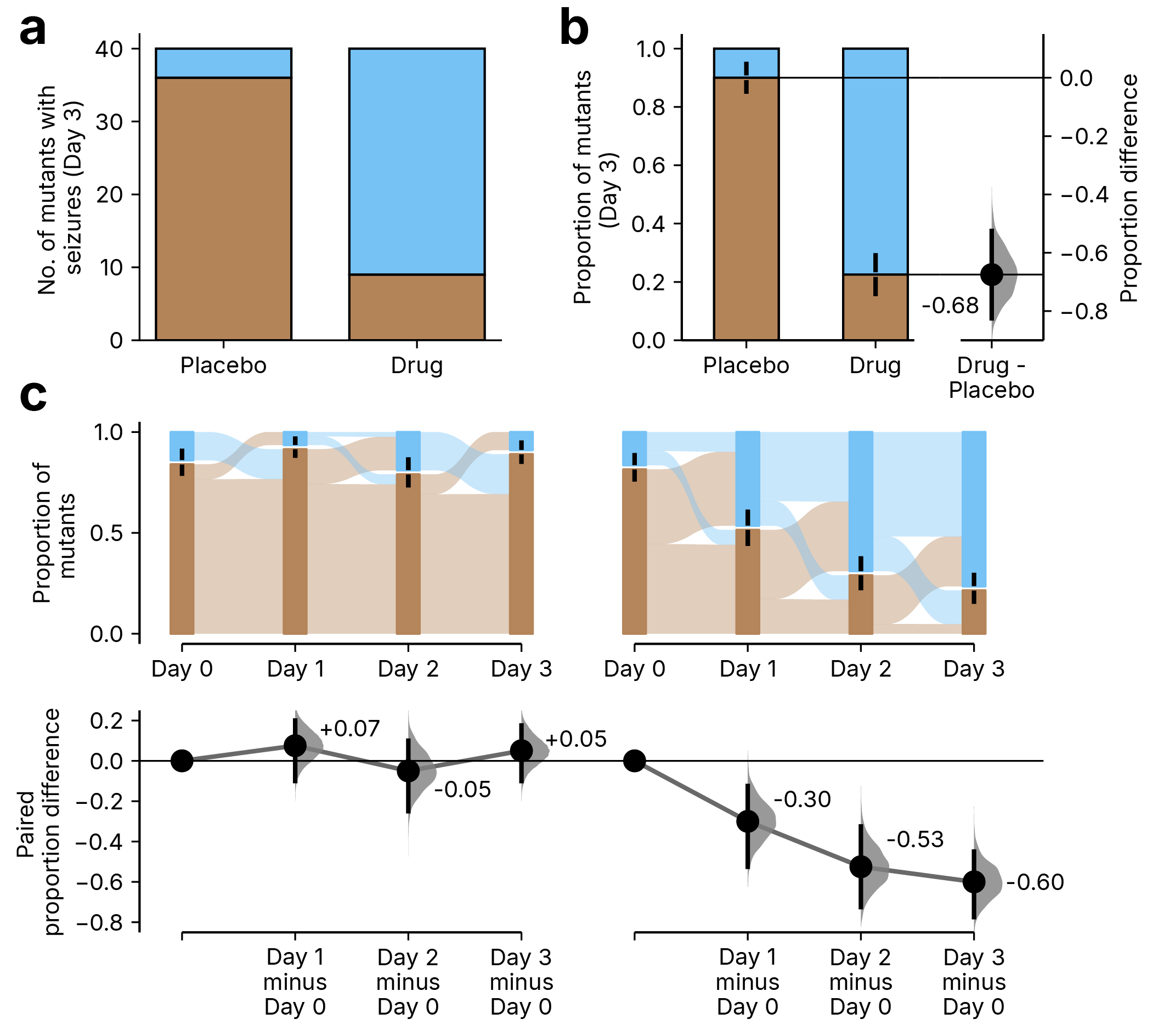
The bar chart in a says something happened; the proportion estimation plot in b says by how much (a 68% reduction) and with what certainty. Figure 3 from Lu Z., Anns J., Mai Y., Zhang R., Lian K., Lee N.M., Hashir S., Wang L.Z., Li Y., Castillo Gonzalez A.R., Ho J., Choi H., Xu S. & Claridge-Chang A. (2026). Getting over ANOVA: estimation graphics for multi-group comparisons. Nature Methods. doi:10.1038/s41592-026-03187-7.
So next time you reach for a bar chart on a binary outcome, consider a proportion plot instead — not just whether something happened, but by how much and with what confidence.
To learn more: read the paper in Nature Methods, the preprint on bioRxiv, or explore the DABEST package.