VISET
Most set diagrams tell you how many items overlap, but not which ones. VISET came out of a need in the lab: when comparing gene sets, we wanted to see the actual genes shared between sets, not just how many there were. I initially built it to do simple itemization, but began developing it further by adding features such as automatic resizing of text and columns according to region area, and an interactive hover version for regions too dense to print. Hence VISET (Visual Itemized SET diagrams).
Traditional Venn and Euler diagrams quickly become difficult to interpret as the number of sets increases, while UpSet plots trade visual overlap for scalability. Neither solves the problem of showing the actual members within each intersection, which often means switching back and forth between the figure and a separate table.
VISET keeps the familiar Venn, Euler, and UpSet layouts but prints the member names directly inside each region whenever space allows. Instead of asking “How many genes overlap?” you can immediately see which genes they are.
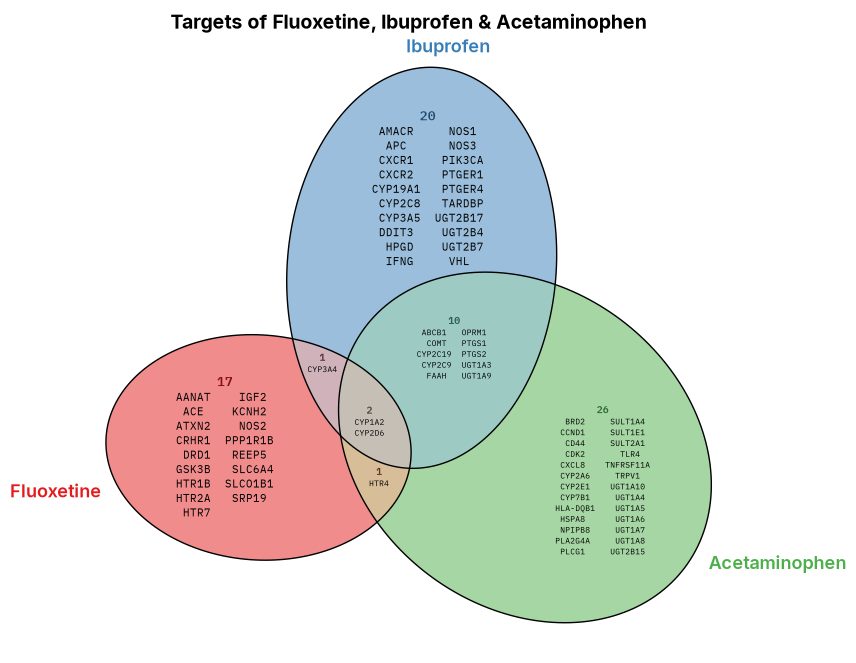
Three drug-target gene sets drawn with VISET. The ellipses are sized to scale and every gene is printed inside the region it belongs to, so you can read the overlaps directly.
Because a region can get dense, every VISET plot also has an interactive version. Hover any region in the diagram below to read its members.
A note on the shapes themselves: Euler diagrams size each region to the number of members it holds, so they represent overlaps more proportionately than a traditional Venn, whose layout stays fixed no matter how many items fall in each region. Either way, once you go past three sets the regions get too cramped and their areas stop being recognisable, so for larger comparisons it’s better to switch to the itemized UpSet plot below, where each intersection bar simply lists the genes it contains. (More on this in the VISET repo.)
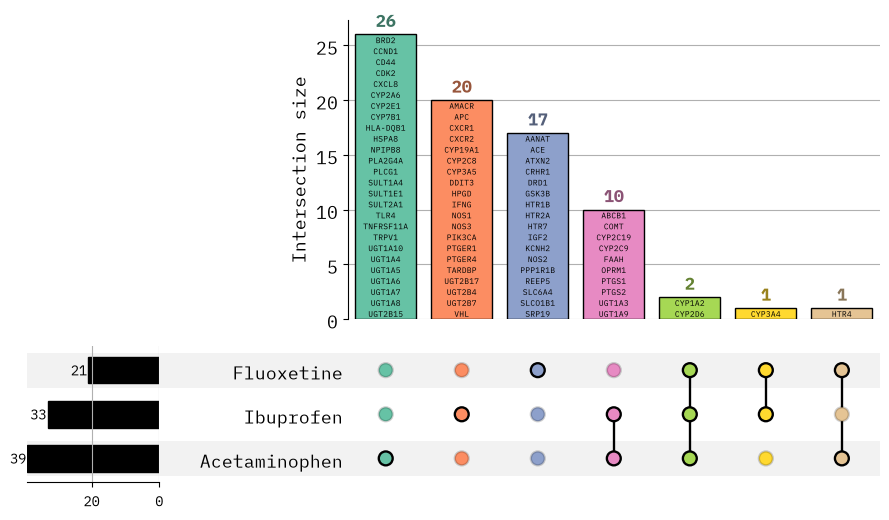
The UpSet view of the same data. Each bar is an intersection, labelled with the genes inside it.
UpSet plots have an interactive version too, with the same hover-to-read behaviour as the Venn above.
The package is written in Python and built with nbdev, making it easy to use both as a library and from notebooks. It supports publication-quality figures, customizable styling, and integrates naturally into existing data analysis workflows.
The code and full documentation live on GitHub.